

From low engagement to personalized, scalable UX
Redesigned a white-labeled B2C mobile app, creating a flexible, user-centered experience that’s projected to increase engagement, satisfaction, and long-term retention.
Read case study
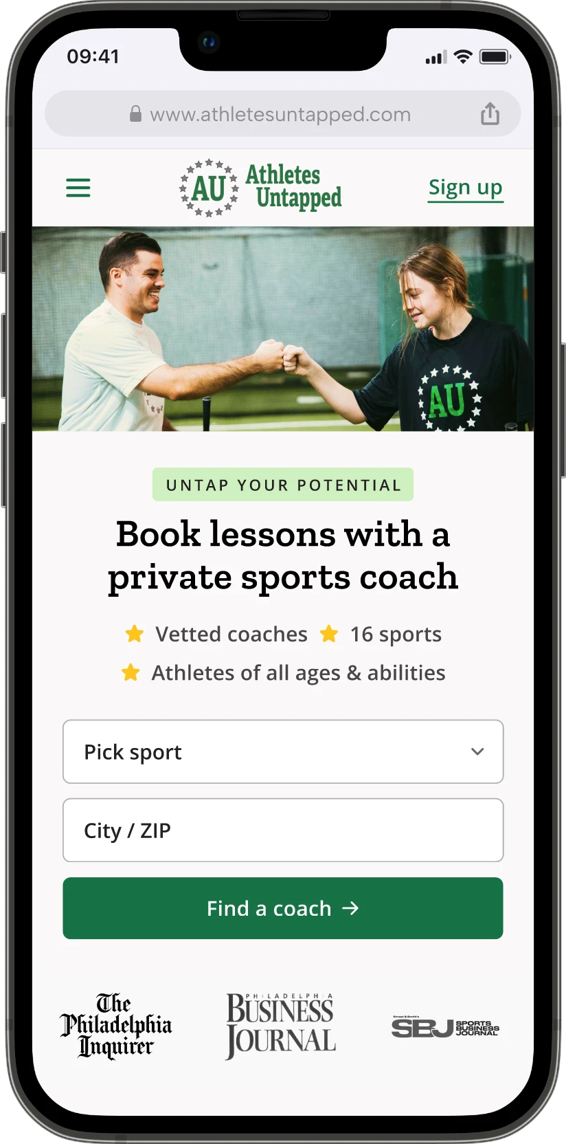
I worked with Athletes Untapped twice. In January 2025, I redesigned their responsive site without losing the look and feel the founders built. In April 2026, I came back to rework search, coach profiles and checkout, and built a design system their one engineer could ship from.
The result: bookings up 5x after the redesign, and conversions up ~15% after the second launch.
Founded in 2021 and based in Philadelphia, Athletes Untapped is a marketplace connecting athletes with private coaches across 16 sports. It is run by a small team led by former college and pro athletes. Their goal is long-term mentorship between coach and athlete, not a one-off matching service.
January 2025
The problem:
Gene, a co-founder, designed the first version of the site at launch. It had the brand’s energy, but it didn’t do enough to earn a parent’s trust or guide them to the right places, so visitors weren’t turning into bookings.
What I did:
I overhauled the platform’s original UX/UI without losing the look and feel that made it theirs, and gave parents a clearer path from landing on the site to finding a coach. The redesign launched alongside a new SEO strategy.
The build was handled by AU’s engineering partner, Brewer Digital. I designed the responsive experience and handed it off to their engineers.
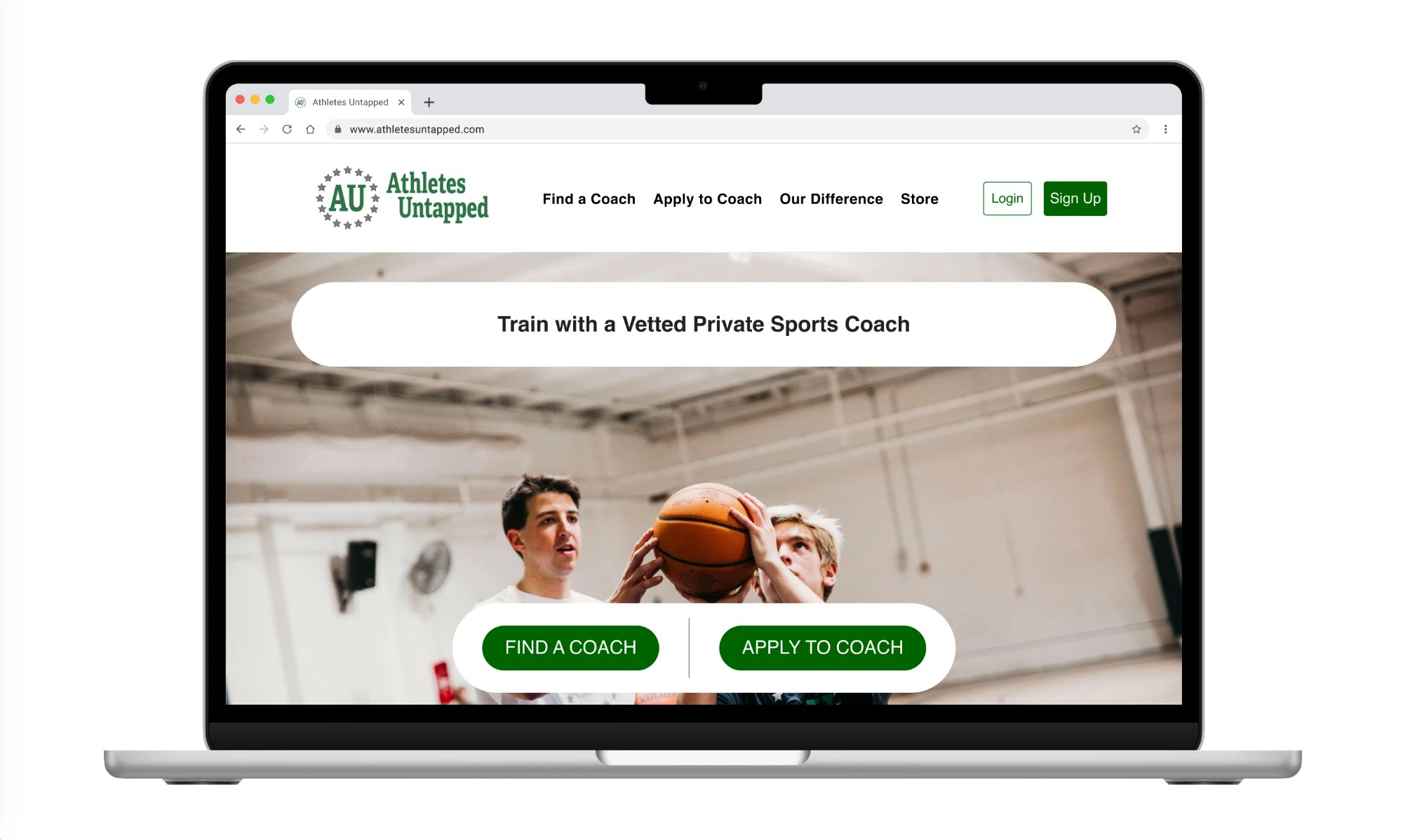
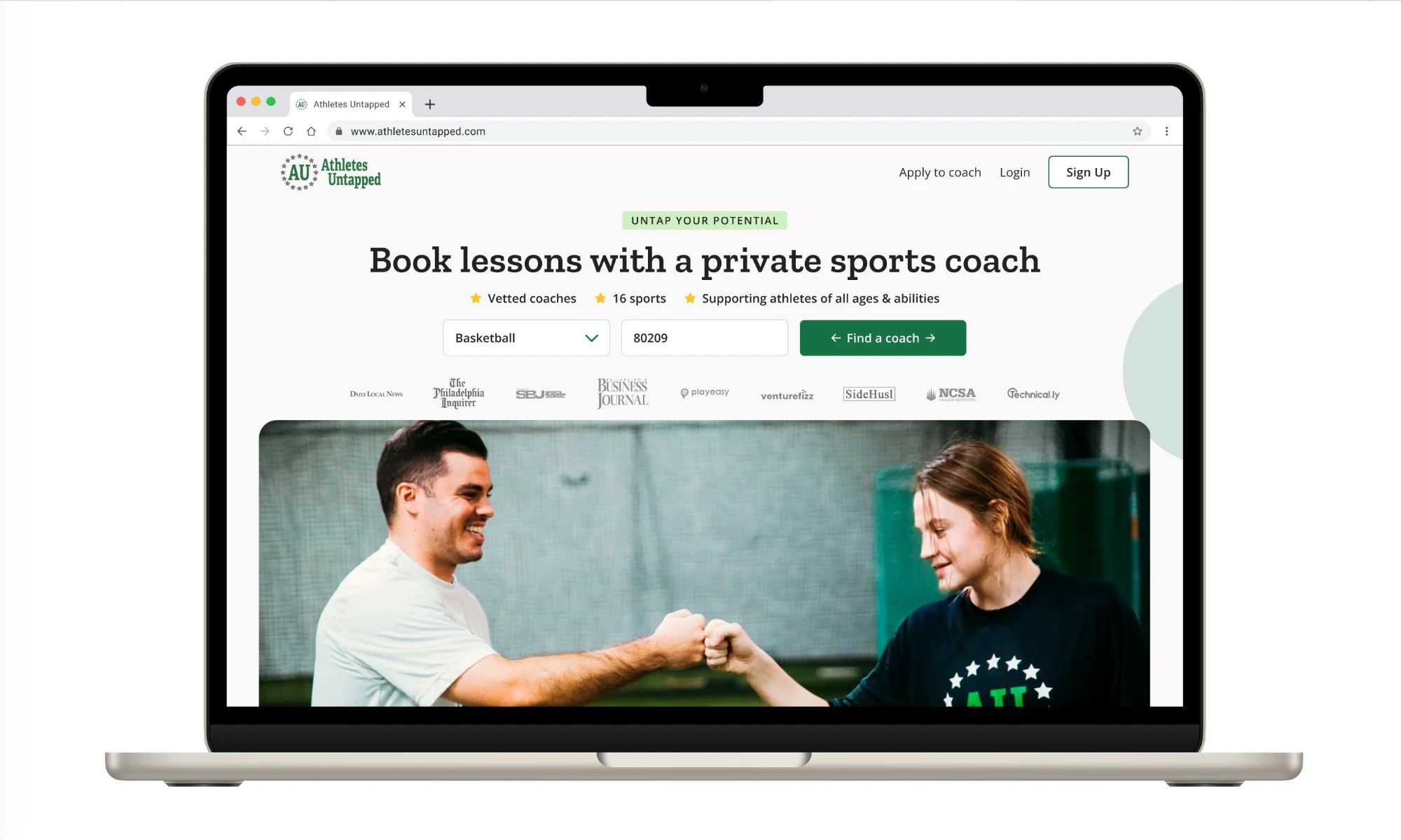
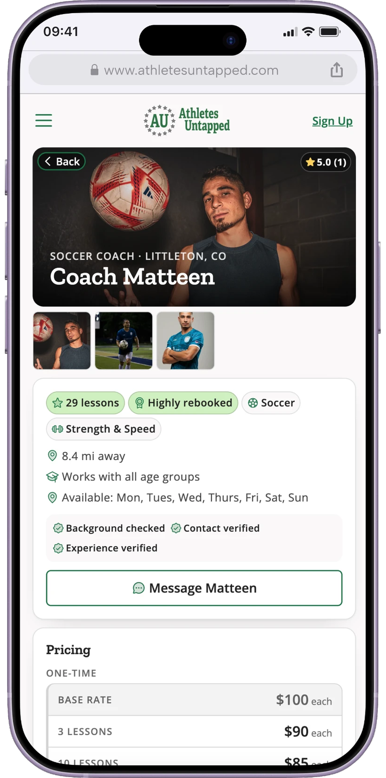
Message volume was a symptom of missing information. I added sections for how it works, FAQ, cancellation policy, certifications and reviews, and handled new coaches honestly so a low lesson count never worked against them.
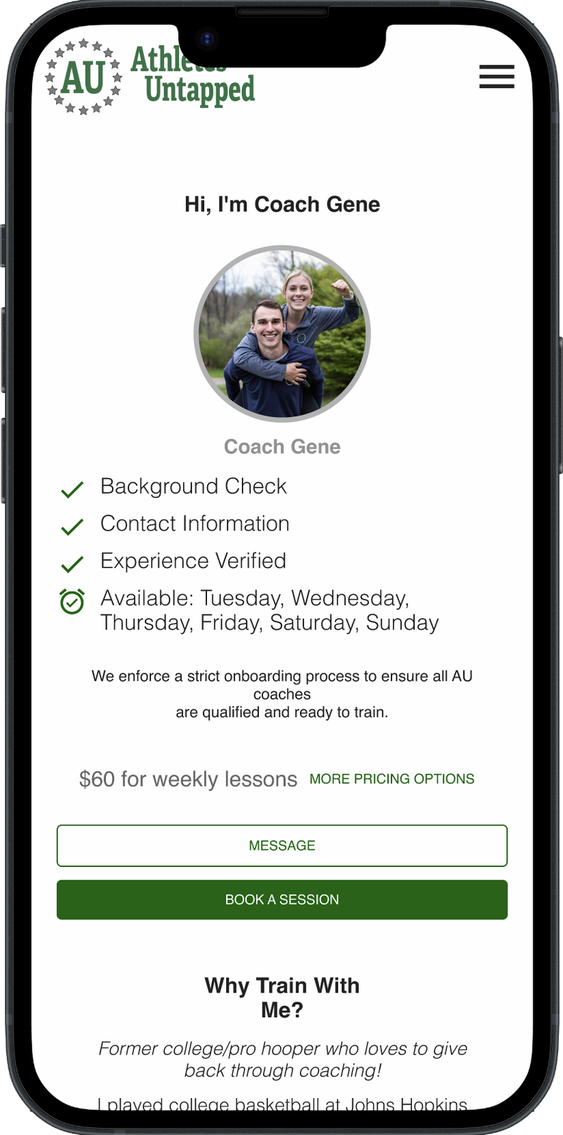
A few months after launch:
“[Jessica] took what was our platform’s original UX/UI and completely overhauled it, while still maintaining the original vibe. Organic traffic is up over 1,000% and we 5x’d bookings.”
 Gene WilliamsCo-founder, Athletes Untapped
April 2026
With more parents finding AU and booking, the team could see where people were still getting stuck. So they brought me back to go deeper into how parents actually book: search, coach profiles and checkout.
Parents were messaging coaches before buying, and many dropped off while waiting on replies.
Rebooking had room to grow, and single lessons were a dead end rather than the start of a relationship.
The experience felt transactional for what is really an emotional purchase. The core user is a parent trusting a stranger with her kid. She is buying confidence as much as coaching.
Credits confused people, and past subscription problems had eroded trust in auto-renewal.
The brief was deliberately open. Rethink search, profiles and checkout, and make continuity the natural choice without it feeling like a trap.
AU is small, with no in-house designer. After the first redesign, they hired a CTO. Gene, a co-founder and my main point of contact, owned the business model and the CTO owned what could realistically ship, so I acted as a design partner, not a pixel supplier. I brought options, explained tradeoffs, and helped them decide what to build now and what to save for later.
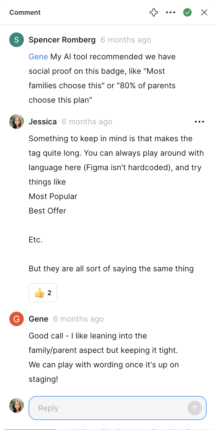
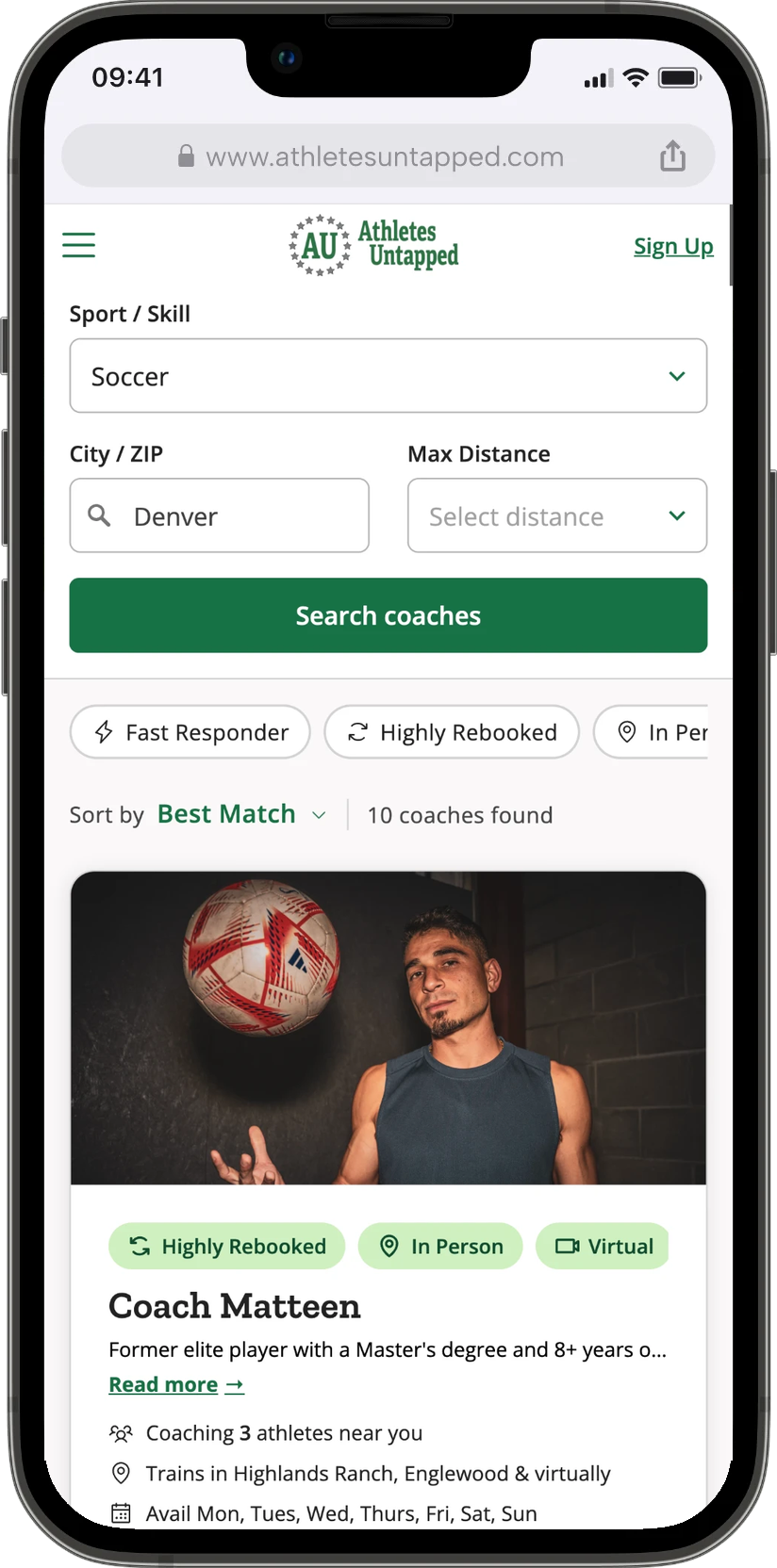
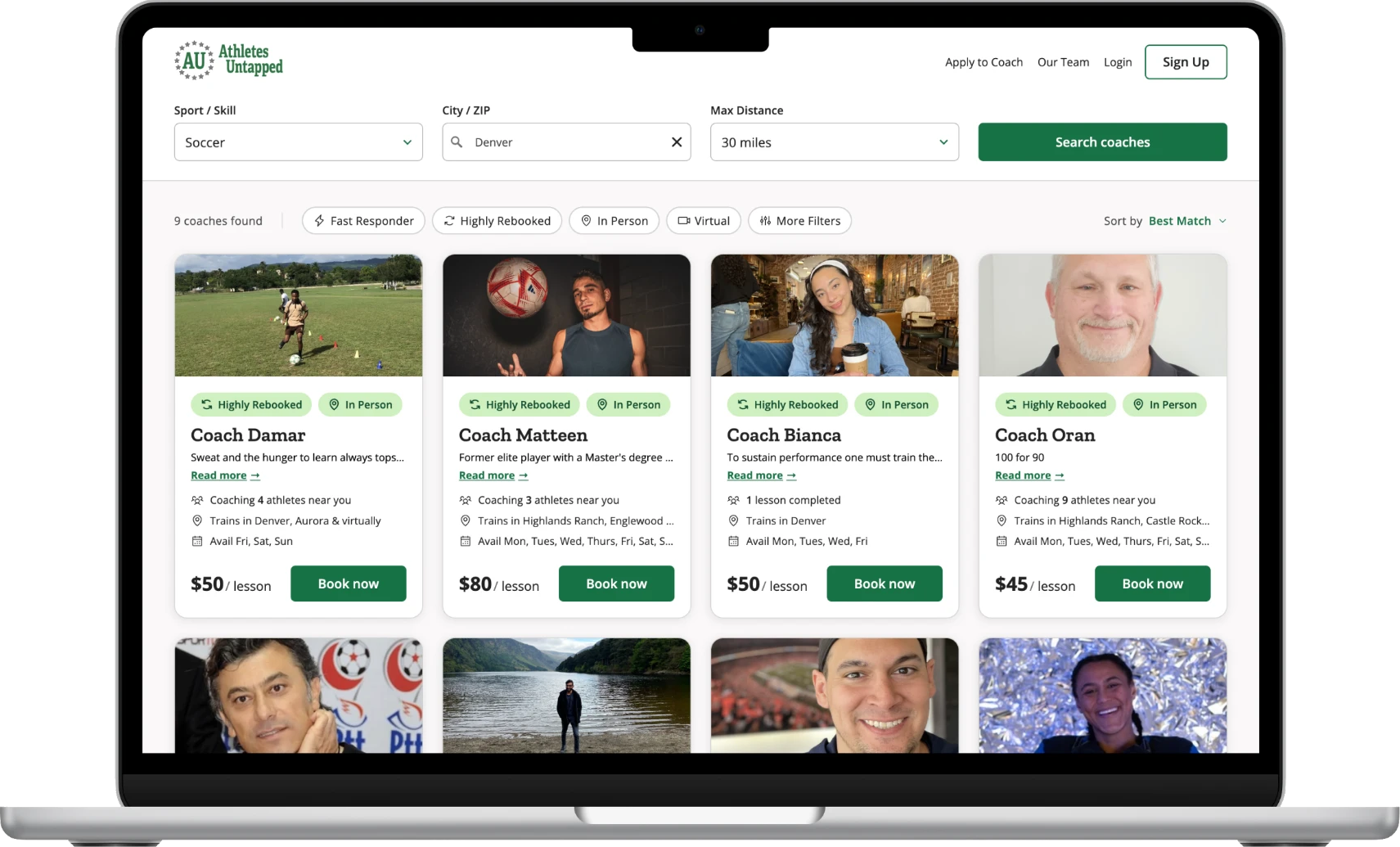
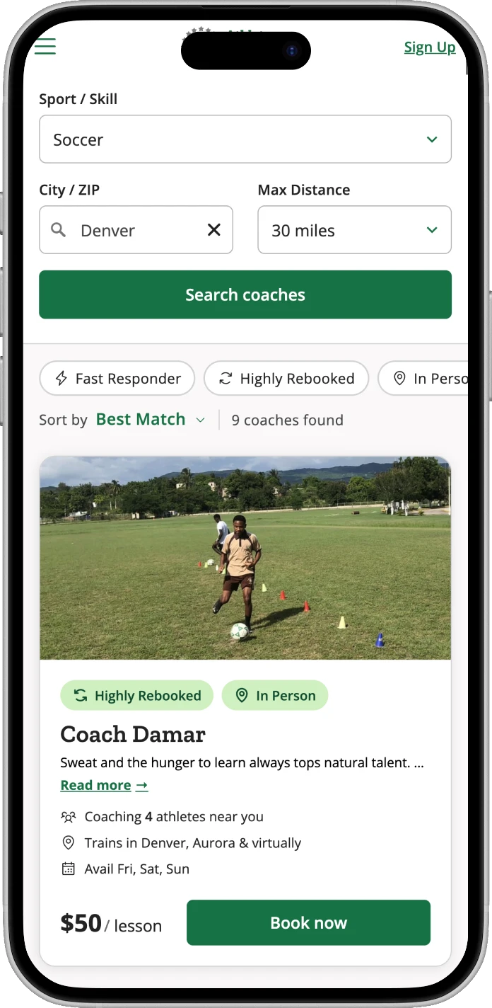
Parents compare two to four coaches on location, schedule and price. I trimmed the coach card to those essentials plus a one-line bio and photo, and added trust tags like Highly Rebooked and Quick Responder. Less text, faster scanning, and an easier way for AU to audit profiles.
Some of the best ideas, like filtering by athlete level or coach background, depended on data and support work that did not exist yet. We designed the layout to take them later and shipped what the data could support today.
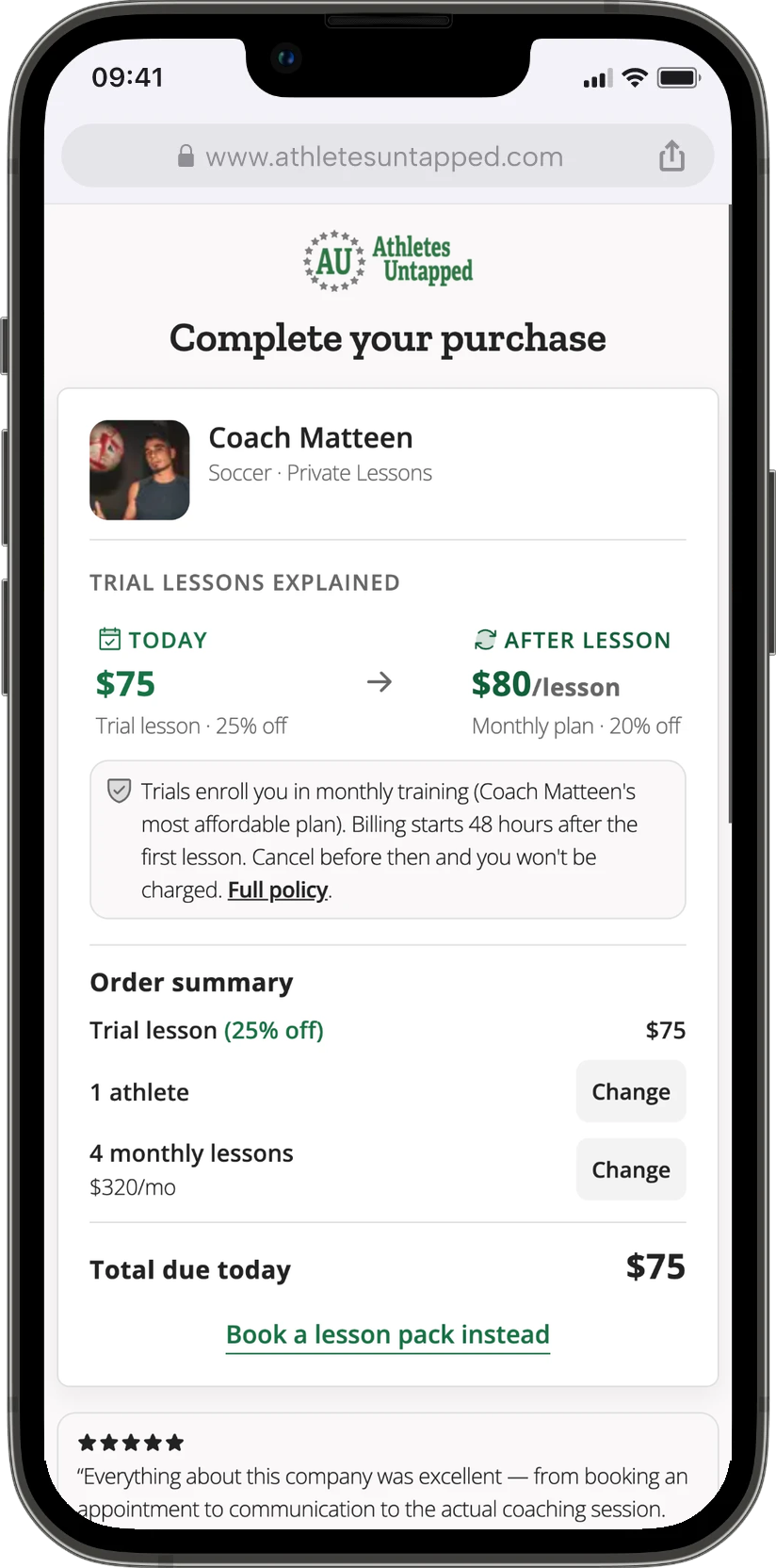
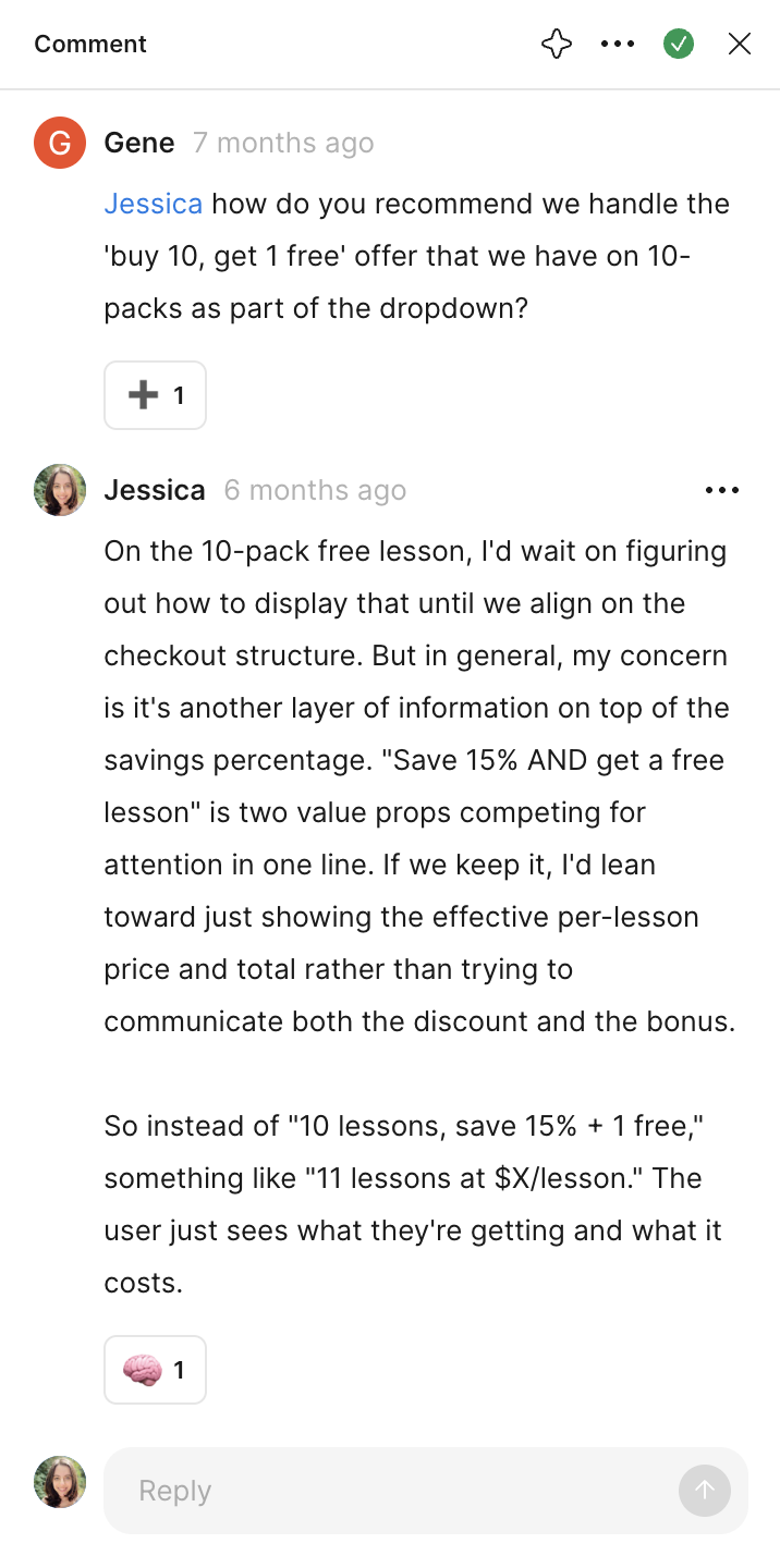
The business wanted a discounted trial lesson that rolls into a monthly plan, plus lesson packs. My first concept showed everything. It was accurate and exhausting: a base rate, savings off it, and a trial discount on top, all before the parent could act.
I mocked four directions, from fully loaded to a single decision, and recommended the simplest: book your trial lesson. Enrollment stays the default and the cancellation point stays clear. Gene and the CTO took that direction and built on it.
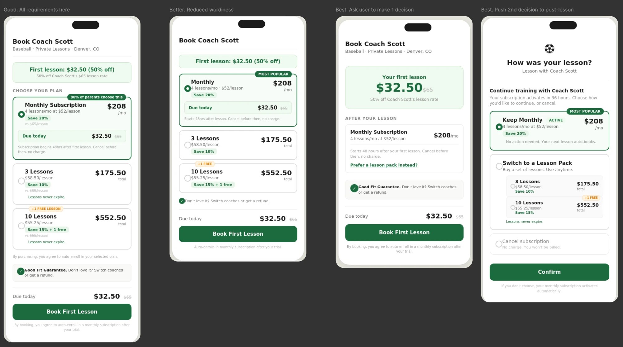
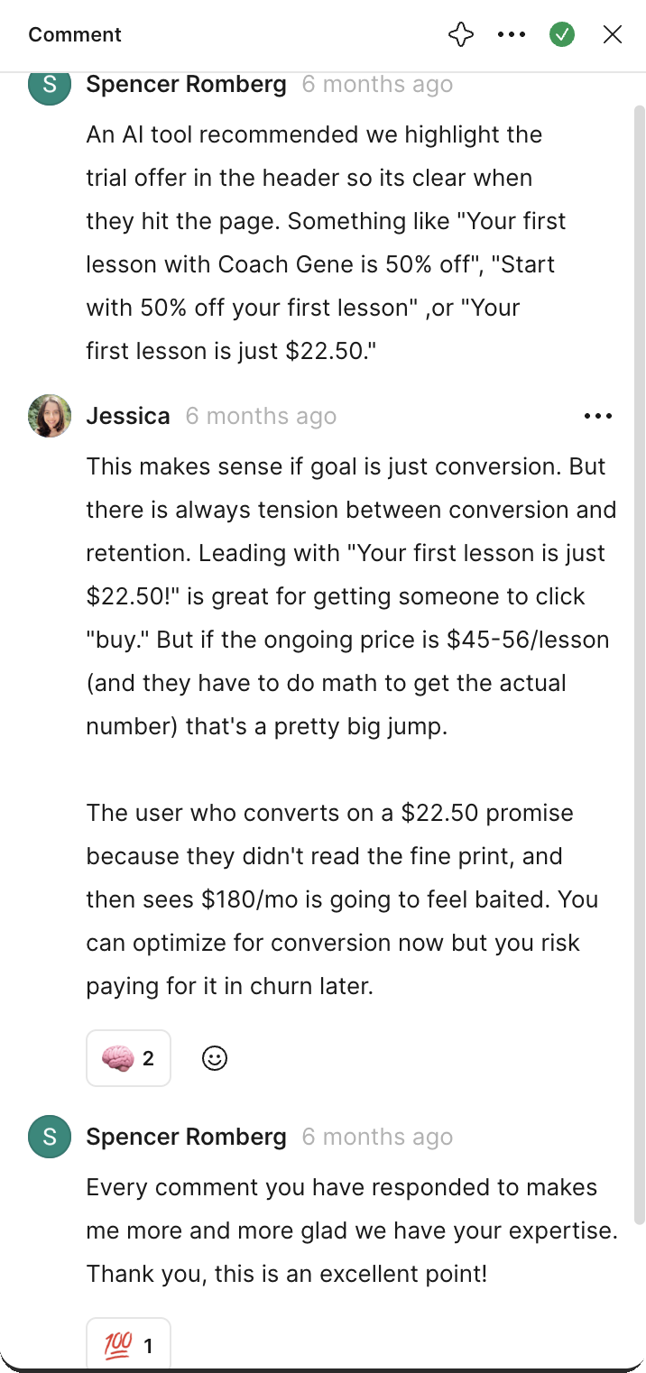
Along the way I helped the team weigh conversion against retention:
“Your first lesson is just $22.50!”Clear about what happens next
The lowest price gets clicks but sets up a shock at renewal.
Save 15% + 1 free lessonPer-lesson price and total
Two value props in one line, simplified to one.
Every option at checkoutOpt-ins and post-purchase upsells
Rare needs like booking multiple athletes moved behind an opt-in.
SubscribeTrial · Enroll
Matches how parents think about their kid’s training.
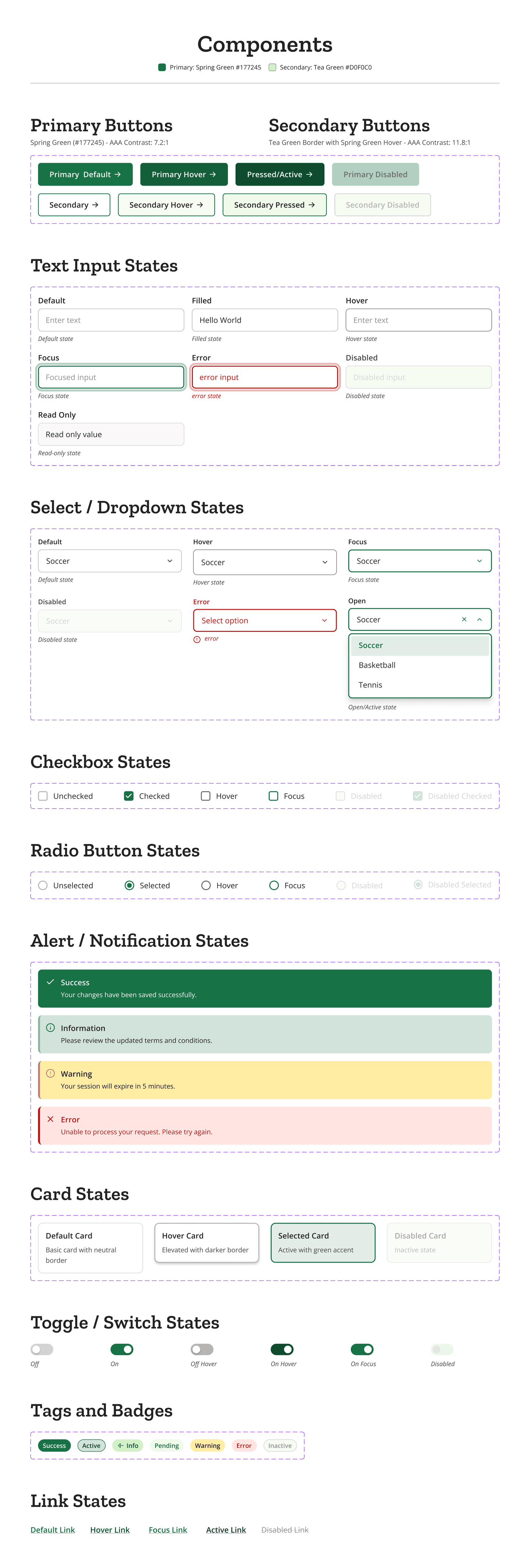
With no in-house designer and one engineer, their CTO, AU needed a system the CTO could pick up and run with: every core component in all of its states, from buttons and inputs to alerts, cards, toggles and tags, built on two brand greens that meet AAA contrast. It gave the team a shared language and a faster path from idea to production.
AU shipped several things together and did not isolate the effect of any one change. However, what they did see afterward was clear to them.
“Conversions are up ~15% since we launched the new checkout page and coach profile/search. It’s leading to more transparency and signups; we’re giving users all the information they need before booking, which has reduced a lot of friction.”
Gene WilliamsCo-founder, Athletes Untapped“I would estimate it cut down the time from idea to production by ~20% on our front end features. It made a big difference! ... Having the design system made it much easier to adopt AI coding agents, and the agents’ output was significantly higher quality when it had the design system to pull from.”
 Spencer RombergCTO, Athletes Untapped
These are the team's own observations, not a controlled measurement. The design was one part of a launch the whole team made happen.
I design around dev time, data availability and SEO, and I phase ideas that are right but premature.
I'll question a decision when it trades long-term trust for short-term lift, and I come with alternatives, not just objections.
Clear specs, honest notes on what is final versus open, and systems that keep working after I leave.
Your customers have questions before they buy, and too many leave before they get answers. Your budget is real, and every decision counts. I work with early-stage founders as a fractional founding designer: research, scope, design and a handoff your engineers can run with, at the level of involvement your budget allows.
Redesigned a white-labeled B2C mobile app, creating a flexible, user-centered experience that’s projected to increase engagement, satisfaction, and long-term retention.
Read case study

Introduced a password-free lead form and tailored content, increasing visits converting to leads by 15% and boosting sign-ups by 25%.
Read case study
Visit-to-lead CvR
Sign-up increase